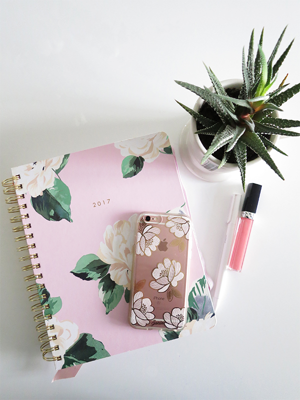
Creating your goals for 2017 is one thing, but actually sticking to them as the year progresses takes organization and planning. While some swear by smartphone apps and Google Calendar I'm more of a pen-and-paper girl myself, especially when there are fun and pretty planners to be had like the Bando Agenda. Last September I made the switch from my Stil Classics Design Love Planner to the large 17-month Bando agenda in 'Lady of Leisure' (a pink floral print) and I've been pretty happy with it so far. All the details after the jump!
First off, the main differences between Bando agendas are in size (small, medium, or large); binding (small agendas are bound notebooks, whereas medium/large ones have a coil spine); time spans (17 months vs. 12 months); and cover designs. Otherwise, the interior pages are virtually identical, albeit at a different scale depending on the size of the planner.
Inside the covers of a Bando agenda
All Bando agendas have at least one folio pocket for loose papers and receipts. In the small agendas, there's an accordion-style pocket on the inside of the back cover; in the larger sizes, there are twin folio pockets at the front of the planner.
Two pages of stickers follow for decorating and doodling on planner entries. I know I'm a grown thirty-something woman who should be beyond stickers, but I like how they dress up my bland adulting notes like "Buy groceries" and "Pick up drycleaning."
Calendar pages let you see how weeks, months, and years look at a glance. Right after the calendar pages, a "Reasons to Celebrate" tabbed section lets you "write down some reasons to party": birthdays, anniversaries, celebrations, vacations, major milestones. There's also a two-page list of statutory holidays as well as all those fun non-holiday days like National Donut Day and Mean Girls Day, which is perfect for upping your Instagram game.
Each month has its own tabbed section and starts off with artwork and an inspirational quote. None of the Design Love Planner's tasteful restraint here—the artwork is unabashedly bright and fun.
The first two pages provide a grid view of the month with a small section for notes on the side. This is where I usually jot down editorial calendar and vacation plans.
The next two lined pages are for notes. If you were a fan of the Design Love Planner's layout, you can use these pages for budgeting and outlining to-dos and goals for the month. I've been using them to write down everything I buy (more on that in tomorrow's post!).
Each week has a spacious two-page layout with plenty of room to jot down and cross out items.
More fun details: Feel-good mantras and suggestions for what to do are sprinkled throughout the weekly pages.
What I love about the Bando agenda
It's pretty, fun, and practical. The cover and coil feel very sturdy, while the pink floral pattern looks great on Instagram and what's inside helps keep me organized. I thought the artwork and details would be too OTT colourful and distracting initially, but they spark joy and don't interfere with the nitty-gritty writing-things-down part. Plus, the stickers!
It's relatively affordable. I bought my Bando agenda for approximately $40 at Indigo, whereas the Design Love Planner cost almost $100 after the US-Canadian conversion and taxes and import duties, even with a sale.
For a large agenda, it's relatively light. There are fewer pages overall compared to the DLP and the paper is thinner.
The two-page unlined layout is more convenient. As I kept using the DLP, I found I didn't like having a four-page layout for each week (time-based appointments on the first two pages, to-do items on the next two pages) because I didn't like having to flip back and forth to see my week. With the Bando agenda, I can see everything at a glance. What's more, the generous unlined spaces let me use more doodle-heavy, bullet journal-esque planning techniques for goal-tracking if I wanted to. Do I want to have colour-in bubbles or grids for remembering to take vitamin supplements, getting a workout in, or drinking my requisite 8 glasses of water a day? With the Bando agenda's relatively simple pages, the possibilities are limitless.
What I don't like about the Bando agenda
The folio pockets are too shallow. The pockets should be positioned about halfway up, not a third of the way. Unless the agenda is secured with the elastic, things fall out.
The large size is too bulky. I went back and forth on whether to buy the large or small Bando agenda at Indigo: Do I go for more writing space and less portability, or do I get the smaller, more portable option that doesn't let me write to the margin because the binding won't let the pages lie flat? In the end I chose the bigger one, but I wish the new medium size coil-bound option had been around when I was shopping because it seems to tick all the boxes.
There's no bookmark in the larger agenda. I tied a piece of pink ribbon to the coil binding and am using that to mark my place.
Overall though, these are minor gripes. The Bando agenda is a great value and a delight to use, and for this girl at least, it'll be essential in keeping 2017 on track.
Shop the post


Awesome post! Thank you for the review.
ReplyDeleteGlad you enjoyed it!
Delete